Trends in Web Design for 2022
Updated: 15th September 2022
Reading time: 7 min
Fashion is everchanging, but it is also recurrent. It is worth knowing the current and upcoming trends to know what might appeal to our audience.
Explore trends in web design for 2022 - what's new, and what will stay with us?
Check it out!
Modern minimalism
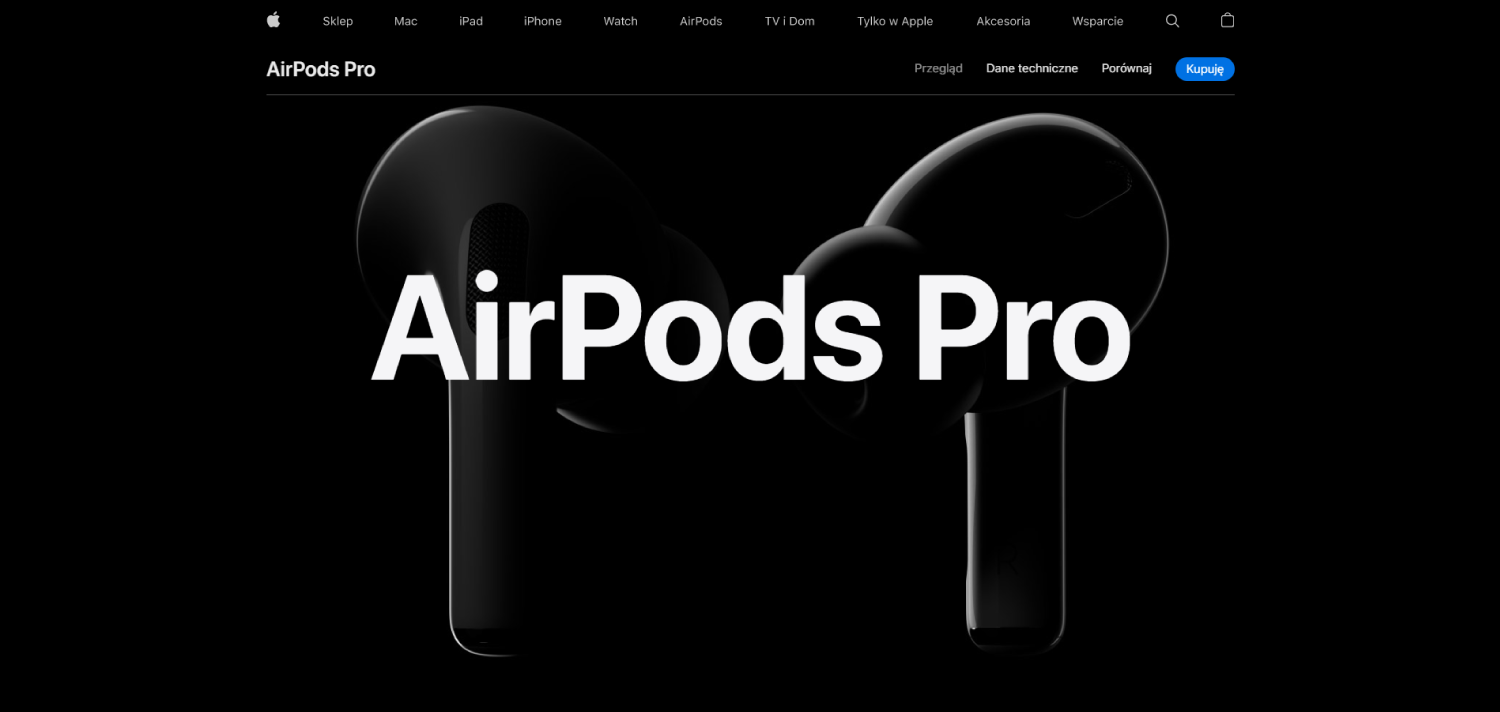
Minimalism will probably never disappear from web design trends. This form is very universal, and it would be a shame to give it up. It does not mean, however, that we should rely on a white card with a black inscription and, possibly, a photo. It is good not to overdo it with the number of additions.
Playing with the font
Charismatic. It may be too heavy for some, but if your website is about art or design, or even if you want to create a portfolio on a website, this style will attract attention. It can take a fixed form, but will also work well with interactive elements. In the case of this style, we do not have to focus on illustrations.
We can even not use them at all, but if we not do it, we should not be afraid of a situation in which the text overlaps the graphic element. Look out for more fonts it might be big in Trends in Web Design for 2022.
WebWave AI Writer
Generate your website copy with just one click.
WebWave AI Writer
Generate your website copy with just one click
Noah - brutalism
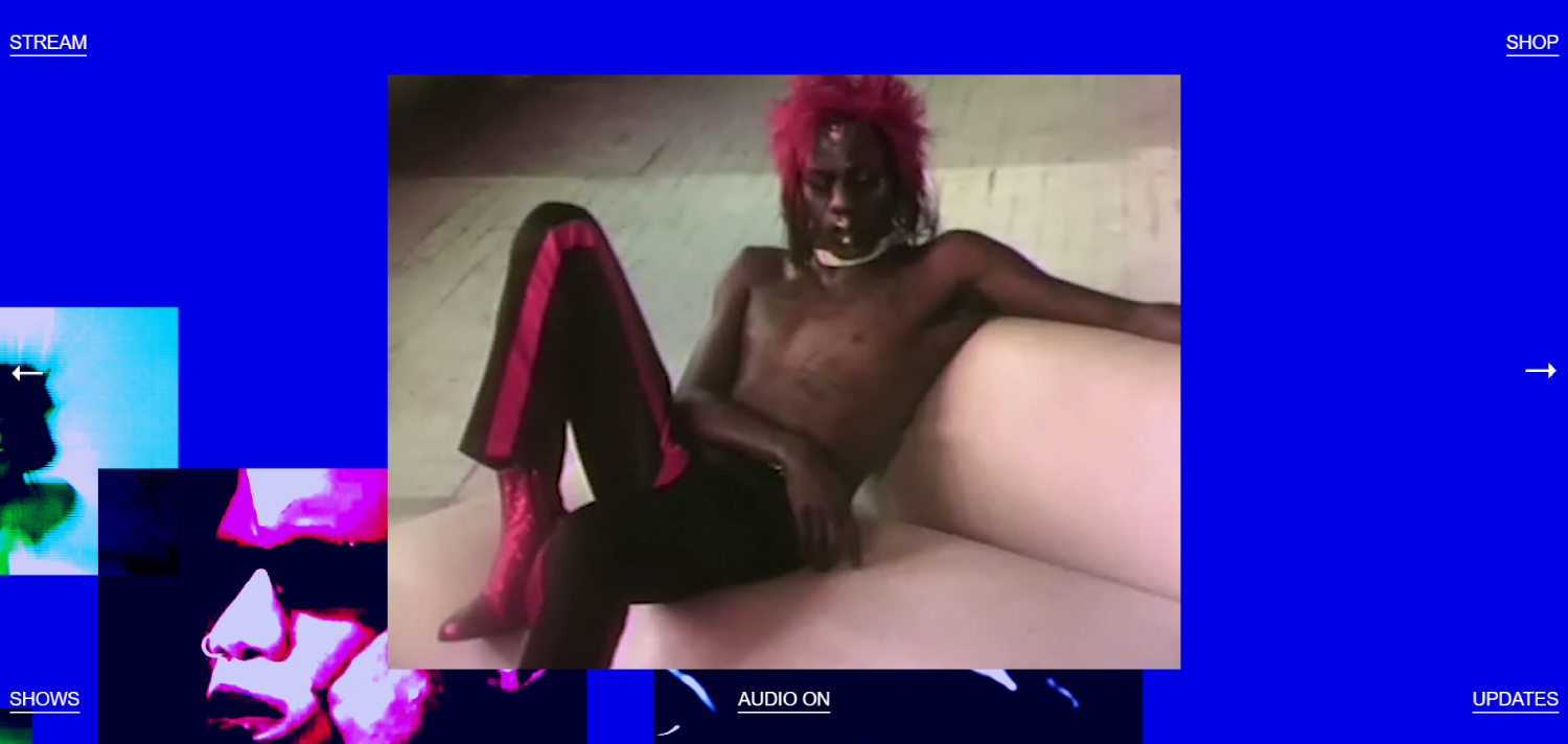
In te oposition to modern trends in web design - brutalism has been around for some time.
It is very characterful and expressive. It doesn't have to be very exaggerated, but the juxtaposition of colours, graphics and fonts can give an impression of saturation.
Virtual - reality
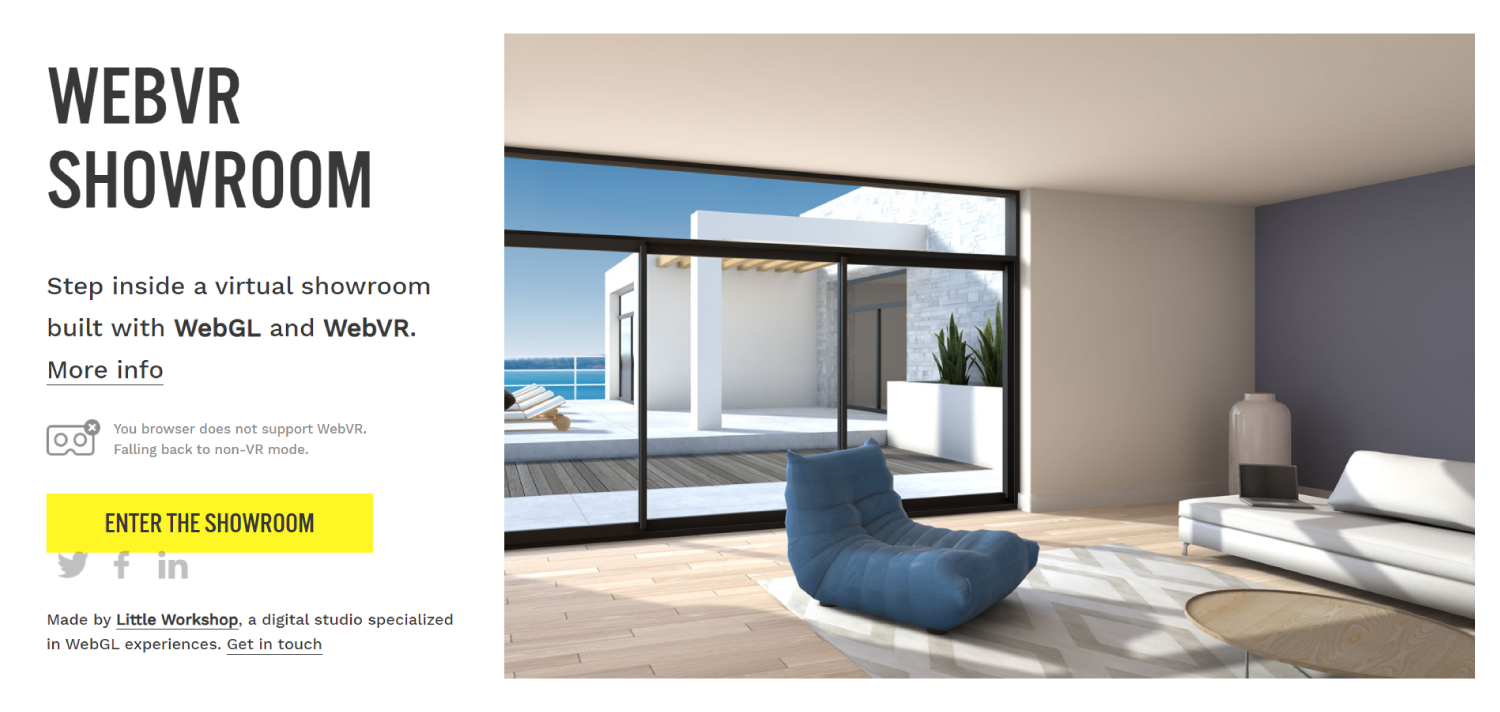
Virtual reality is invading more and more parts of our lives. Of course, we can see it in films, music videos, games...and on websites. This form of project can be very valuable for websites offering e.g. sale of furniture or real estate, but of course it is not a limitation. What matters is a creative approach to trends in Web Design in 2022.
Dark mode
Dark mode has taken over much of social media. Of course, it is not something compulsory, more an alternative to the standard colour scheme. Why do so many people choose it, giving up the 'light setting'? For some, it will be a matter of aesthetic preference, and for others, simply convenience.
A good step might be to give your site a choice, i.e. to provide a switch whereby you decide which mode you use.
Gradients
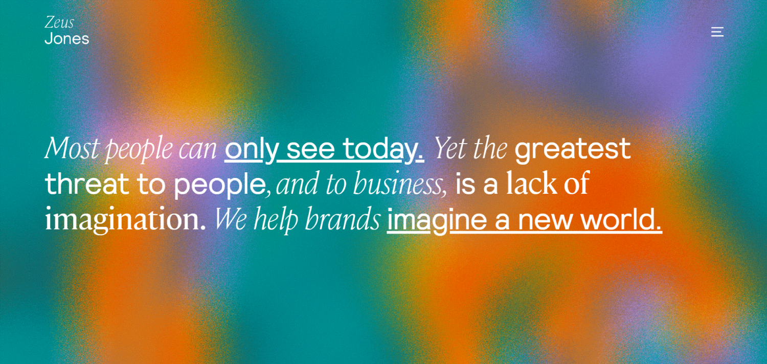
Gradients are back. Admittedly, they have never really lost their popularity, but very often this effect was associated only with two options: rainbow or black and white.
Some time ago they were used solely as a background. Now they can be used as a filling for highlighted text or add depth and dynamism to an illustration. They allow you to create a smooth transition, and with the right choice of colour palette you get a modern look to your design
Retro
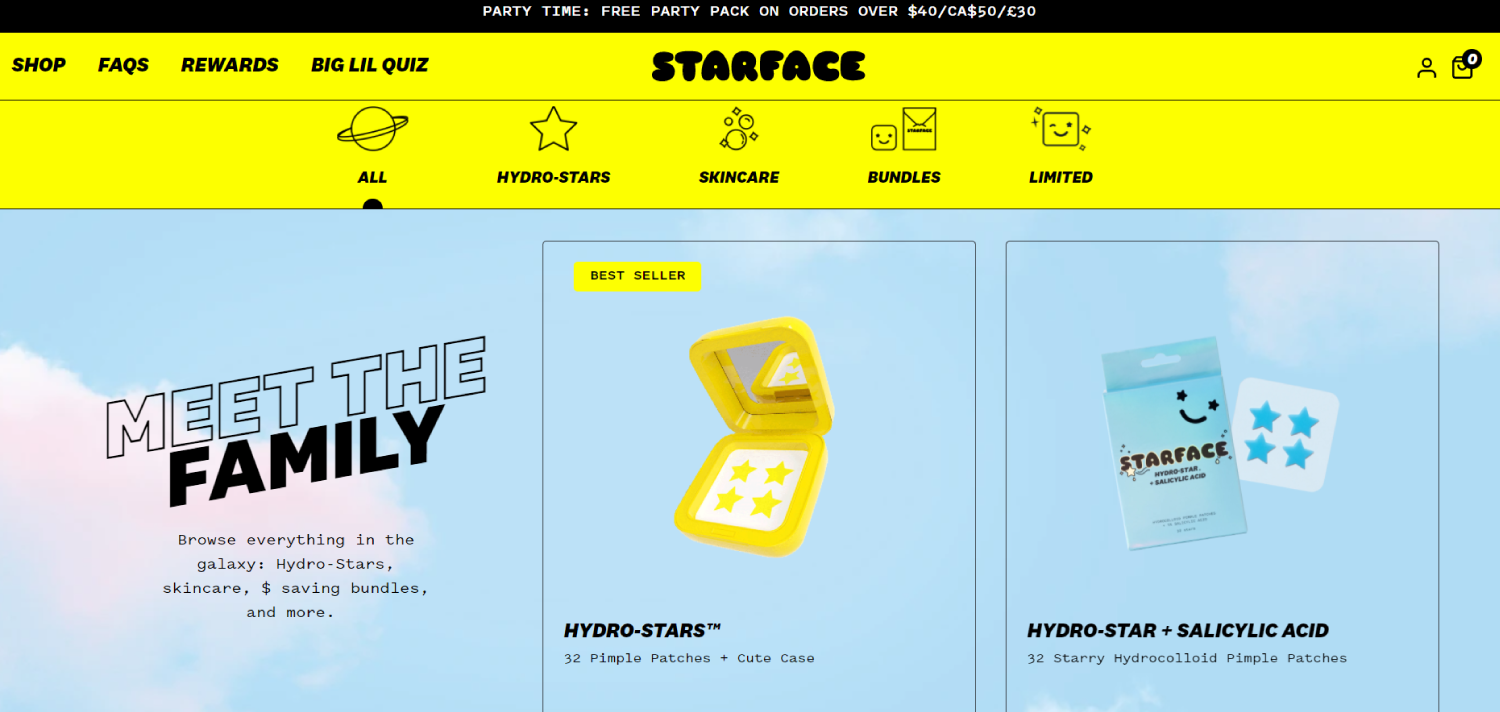
The 70's, the 80's or maybe the 90's... any of these options are covered under the heading of retro web design trends.
For example, the inspiration from the 90s allows for a lot of fun, expressive colours, simple, cut forms and a lot of saturation. To some it may seem comical, but on the other hand it guarantees the originality of the design.
Neomorphism
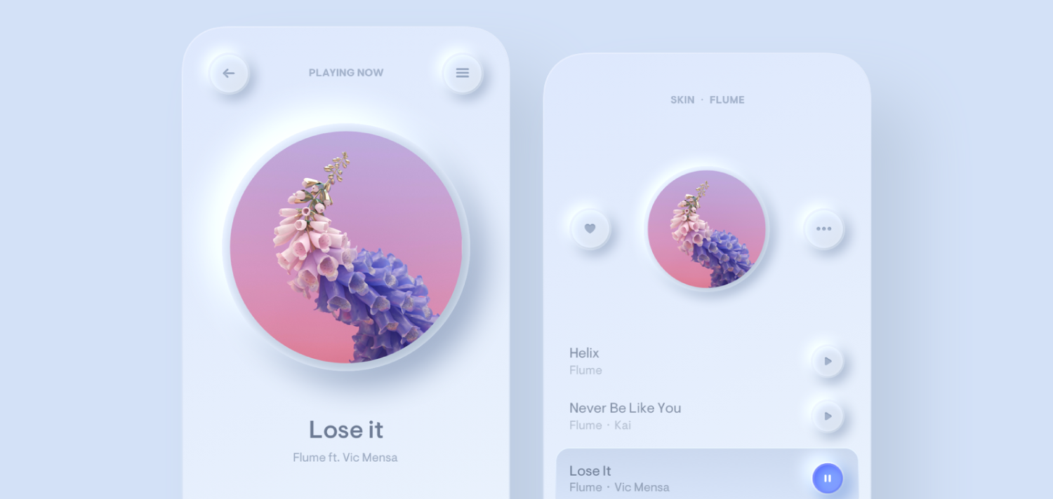
The neomorphism trend is still going strong. It is a very frugal style. Mainly based on shadows and small changes of colour - still in a similar tone. Because of this, among other things, we create an impression of extraordinary purity, which allows the user to focus on important content.
It will work best in mobile app design.
As elements such as the button are not in contrasting colours to the background, the design must be created extremely skilfully, otherwise we can just hurt our project.
Summary of Trends in Web Design
These are certainly not all the trends we will encounter in web design in 2022. Many new ones may also emerge in the meantime.
One style will work better for an online store, another for a portfolio, and another for a business website. The choice is huge, and it is worth considering whether any of them will make our website more attractive.
Authors: Kaja Rowicka, Paula Niziolek
Other articles.
WebWave website builder is your AI-powered solution for building an online presence. Create your website in 3 minutes, add an online store or a blog, and grow your business.
We created this website with WebWave.
Follow us on social media


