
Effective website navigation. What does it mean and how to achieve it?
Updated: 22nd September 2022
Reading time: 6 min
Intuitively, navigation is one of the most basic elements of a website.
What should we focus on while creating a menu?
For starters, the most important - types of menu
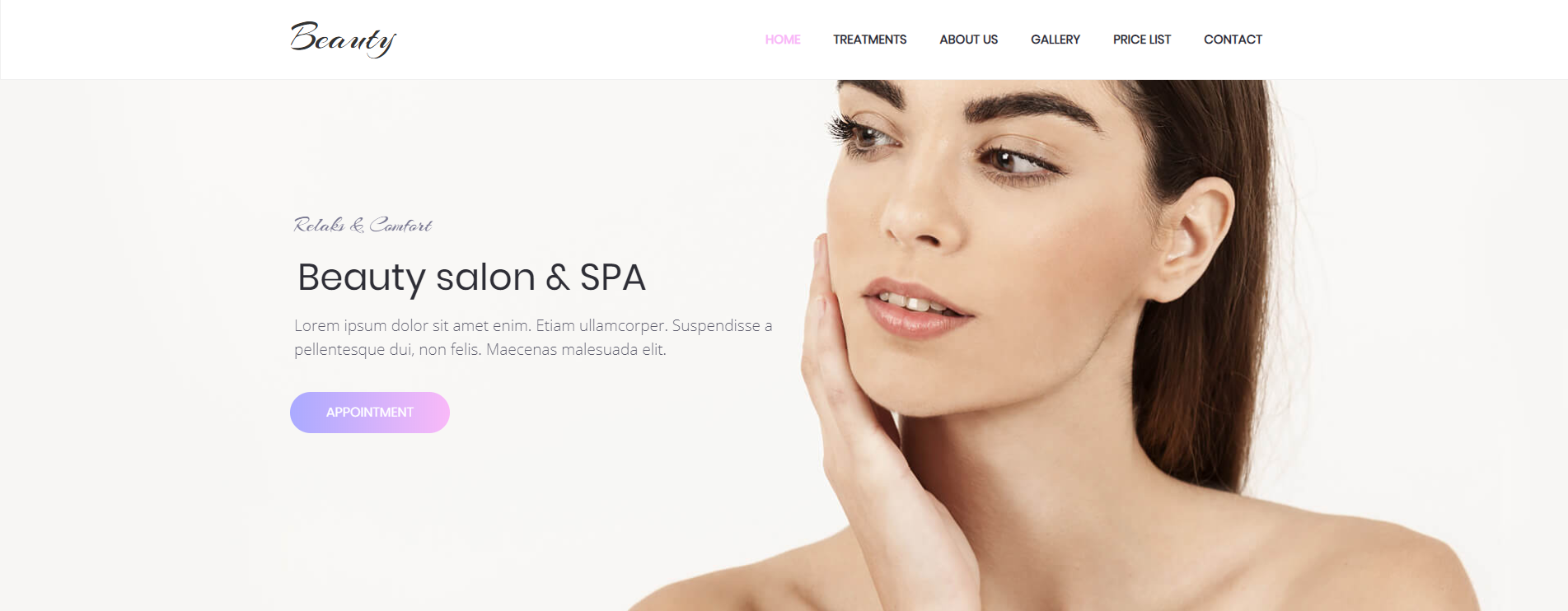
The clear and intuitive menu is a sturdy base of every good website. It allows users to easily move around subpages and creates a user-friendly experience. Unfortunately, building an effective menu can be very challenging…
The type of menu depends on the type of website
Type of menu is mostly determined by the type of your website. Depending, if it is a well-developed and complex website or just a personal page. menu styles will differ. The simpler the website, the simpler should be a menu.
WebWave AI Writer
Generate your website copy with just one click.
WebWave AI Writer
Generate your website copy with just one click
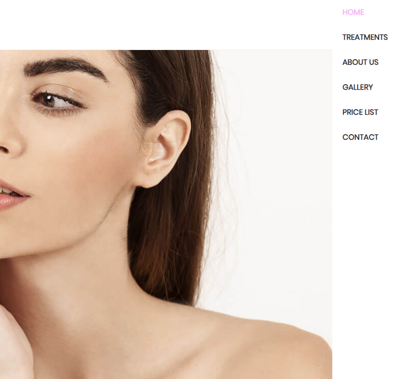
Menu - vertical or horizontal
Before you decide, you should think it through and make sure that the menu will be visible and accessible. Menu type should fit into website layout and be easily noticeable.
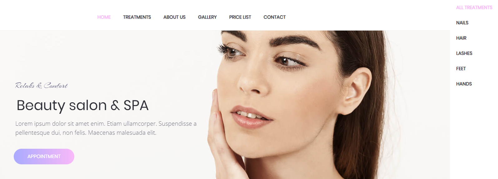
The horizontal menu is easier to implement on responsive websites and shows users full website content. Keep in mind, that for the horizontal menu to be clear and intuitive, you need to fulfill two conditions.
First of all, the horizontal menu shouldn’t have more than five categories. Secondly, it is important to create no more than two roll out levels. If you implement more, users might get confused.
If we are dealing with a more complex website, it is better to implement a vertical menu, which has no restrictions in terms of a number of categories. Users will find it easier to search a certain category in a vertical menu rather than horizontal.
Dedicated menu for each subpage
Web designers who implement complex menus with many categories came up with a very clever idea.
They design a dedicated menu for each subpage, which allows home page menu to contain only a couple of basic categories. When a user enters a certain category, the menu becomes more complex and presents more related topics.
One website, two menus
When it comes to the menu, the clearer the better. Transparent navigation improves the chances of users taking an interest in your offer. That is why some webdesigners decide to implement two menus on a website - horizontal and vertical.
In this case, the horizontal menu is the more important one - it is basic navigation on a website. The vertical menu allows to present categories with more details and apply filters.
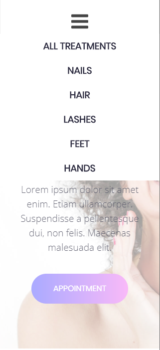
What about… hamburger menu?
Simple hamburger icon becomes more and more popular nowadays, but keep in mind that this kind of menu can be deceitful. Firstly, there is a group of users who are too lazy to unroll menu. Secondly, some users don’t recognize the hamburger menu icon (it is useful to place “menu” next to it) and simply exit website without reading your offer.
Horizontal, vertical, double - keep it simple
Building websites are all about thinking outside of the box and being creative. It allows unusual practices in both graphic design and layout/content area.
When creating a menu, remember to keep it simple. Speaking from experience, there is no point in writing long and poetic wording or placing super creative names.
What is more, not even the prettiest icons work as well as clear information. WebWave guarantees you that keeping it simple to save users time and encourages them to return to your website.
It is important to stress out, that order of categories in the menu is crucial. You should put them in an intuitive way, just how users expect it. To achieve that, visit some popular websites and observe how they manage to build transparent navigation.
Small footer, huge possibilities
Website footer is an area when we can put much important information. If you don’t know how to creatively implement navigation on this section, use some common practices.
On companies’ websites, footer is usually an area where users find contact detail, terms of use, partnership links and category tree.
Users usually expect to find there also social media redirects and job opportunities.
Tiles navigation
Clarity and simplicity are the main advantages of tiles navigation. By using high-quality graphic you can transfer the user to a certain place on a website.
If you decide to use big symbols, the user will be able to easily and intuitively surf on your website. Tiles navigation is particularly useful on websites with graphic content like a portfolio.
Key to successful navigation
When creating a website you need to keep in mind that good navigation isn’t just about menu and footer.
Website navigation should predict users’ intuitive moves and thinking processes. Why is it so important? With transparent navigation, we can link together all subpages, show the user where he is at and where to find topics he is interested in.
A couple of useful information about building an effective navigation
1. Remember about margin
Elements that transfer the user to a new section or display additional information should have a wide “clicking area”.
Don’t force users to make an effort to precisely click on elements. Redirecting field should be wide enough to easily transfer user where he wants.
If you are using WebWave website builder, you can set element size with accuracy up to 1px. Learn how to build a menu on your website.
2. Make sure the user has an easy way back to the home page
Regardless of a subpage user is currently on, he should always have an easy way back to the home page - ideally with only one click.
There is one simple method to achieve that and, luckily for us, users find it obvious. Many users intuitively click on company logo, so it is worth to link it to the home page.
3. Last but not least… Think like a user
Forget for a moment that you are a webmaster. On this level of building a website, it is useful to think like a regular user. Keep in mind that not everybody surfs the internet as easily as you do.
Simple conclusion - creating a good menu is not rocket science
Good website navigation allows users to quickly find what they are looking for. If they easily enter the wanted category, they won’t get a chance to get bored with your website and exit.
To sum up, the better navigation, the smaller number of users leaving the website and longer viewing time. Don’t cut corners when building a menu - it is one of the most important elements on your website. Spend on it as much time as necessary...
...or build your website with no coding in WebWave :)
Author: Milena Antoniak
Other articles.
![]()
WebWave website builder is your AI-powered solution for building an online presence. Create your website in 3 minutes, add an online store or a blog, and grow your business.
We created this website with WebWave.
Follow us on social media