Reading time: 8 minutes
Published: January 19 2023
Ewelina Wróbel
Best Homepage Design Ideas for Your Online Store
The homepage of the online store distinguishes it from the competition. Most often, this is where the customers visiting your website initially get. As many as 25% of people who come into contact with your store for the first time make a purchase decision solely based on its appearance and functionality. Therefore, it is worth paying close attention to this element when creating your website. From this post, you will learn what elements should be included on the home page of an online store. You will also learn specific examples of well-designed websites of this type. You don't have to design the site yourself. Furthermore, you can find the best website homepage design examples in the WebWave creator.
The best homepage design for an online store
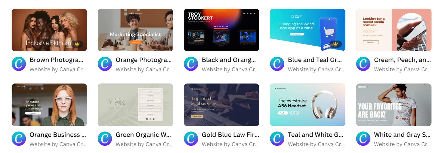
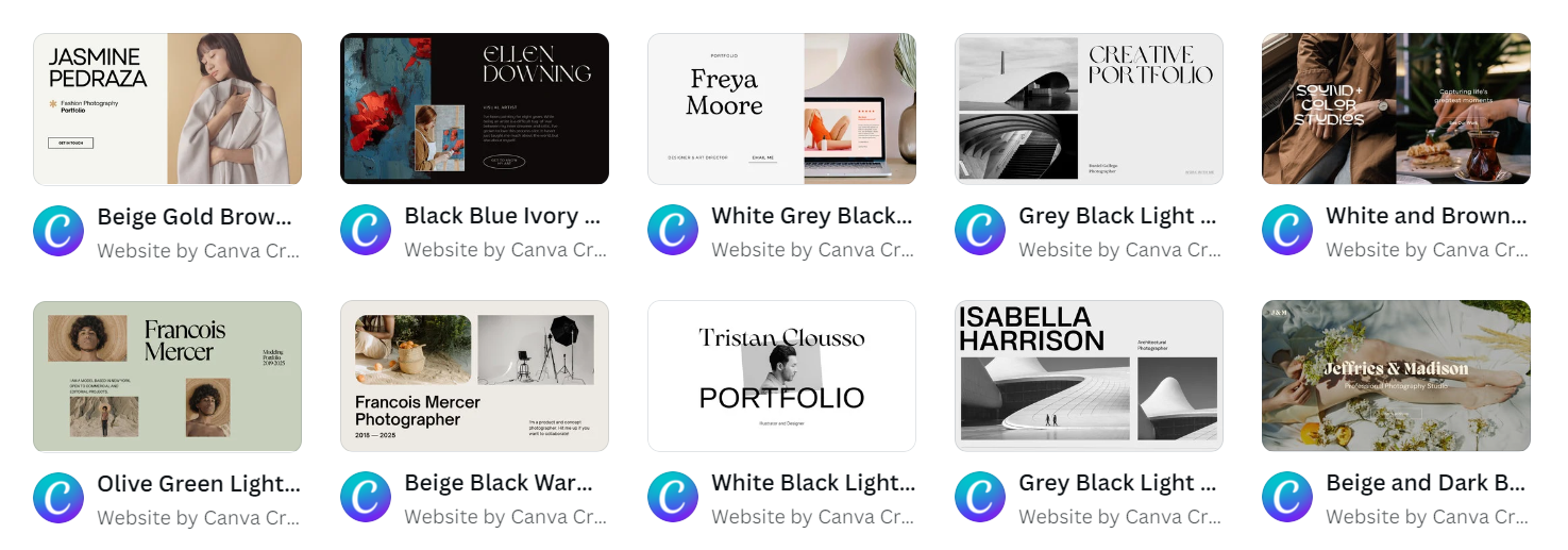
If you want your e-shop to attract customers, you should include some elements on your home page. The effectiveness of your website will depend on whether you use them in your project and its quality. In WebWave you will find examples of the best homepage, including the necessary elements. Remember that first impressions matter a lot in UX! Choose drag and drop website builder and surprise your customers!
The homepage greets your customers when they first enter the site. Think about what should be on your store's homepage. What will customers expect to see? What will make them move on to further browse your offerings? The answers to these questions will help you determine what you want the homepage to look like for your store. Choose a color palette and follow the trends. The landing page is a welcome development that is expected to translate into increased purchases and encourages people to stay on the page. Simple design and branding are issues worth paying attention to. The homepage and website are to be user-friendly. Learn about excellent homepage design.
UX and UI of the website's homepage
When creating any website, you have to look at it from the point of view of the person who will use it. User experience is the overall experience when using the website. User Interface refers to the user interface, i.e. elements used for its interaction with the website. That's why your homepage should be created with the utmost care and attention. Check out our blog for more on UX best practices on the site.
Well exposed Value Proposition
Value Proposition is the benefits that the customer will gain by using your offer. VP answers the question, "why should I use this particular offer?". It should be a feature that distinguishes you from the competition. In the case of online stores, this is very important. Competition in the market is fierce, and many smaller and larger companies are fighting for customers.
The value proposition will depend on the business model adopted. Maybe you offer unique made-to-order products, or you can deliver the goods in less than 24 hours. Remember to highlight the benefit that the client will not find in the competition. This will make your offer unique.
Friendly navigation
This is one of the most important aspects of the user experience (UX), which we wrote about above. Well-designed navigation makes it easy to find a product quickly. It must be remembered that time plays a significant role here and if the customer loses too much of it, he will quickly leave the store. There are several elements to good navigation.
Mobile friendly
The best homepage design examples should also be adapted for use on mobile devices. It's a must-have in today's mobile world. A page that doesn't display properly on a phone will quickly close, and the user will move on to another. Stick to clean design. The best practices presuppose that the site does not distract a potential customer from the product. Too many stimuli, pop-ups, and other design elements can distract from what is most important. Choose WebWave and design the best homepage.
Content 2
WebWave AI Writer
Generate your website copy with just one click.
WebWave AI Writer
Generate your website copy with just one click.
Product page
A well-planned list of products makes it easy to find them. If the store's offer is small and consists of only a few items, you can simply present them one above the other.
In the case of a wider offer, it will be necessary to divide the list of products into categories. Best Buy's website is a good example of such a solution. Even though you can find a huge amount of items here, navigation is easy.
Search bar
This element is especially useful when a potential customer is looking for a specific item (e.g. a selected phone model or a red M-size T-shirt). It is good if the search engine shows suggestions when the user is entering the phrase. The ASOS website can be distinguished at this point.
Recommendations
By distinguishing individual products from the entire offer, you will facilitate the customer's choice. Product recommendations can take various forms:
-
a gender-based division that works well for clothes and shoe stores;
-
complementary products that match those already in the basket;
-
the new arrivals you want to promote;
-
walkthroughs showcasing feature created using product tour software;
-
bestsellers - products popular among existing customers will probably also be liked by new users.
Interesting recommendations can be found on the Decathlon website. In this case, users are offered products grouped into categories depending on their purpose - for the mountain trail, for the water, etc. We can also notice the division of the offer according to customer profiles - women, men, and children.
Cart
The shopping process in most online stores is similar. The customer selects products that end up in the shopping cart. Then, the user goes to the summary page, where they can check the correctness of the order, and choose the shipping and payment option.
Users are used to this form of shopping. Therefore, it is not worth changing it. There should be a shopping cart icon on the home page of your online store. By clicking on it, the user can view purchases and place an order. Pages on your website should be clean and simple.
The shopping cart icon should be visible. Most often it is placed in the top bar of the page.
Photos
The customers buy with their eyes. This principle also works on the Internet. Therefore, product photos should be placed on the home page of the store. They must be original. Images downloaded from other websites lower the position of the website in the search results, and above all, they may also raise doubts when it comes to copyright. You may even have to remove backgrounds from images. This enhances the appeal of pictures, especially product photos. Use a background remover for this purpose.
Therefore, it is better to decide to cooperate with a photographer. You can also try to take pictures yourself. Appropriate quality equipment is getting cheaper and people who are interested in photography can take on this task.
The home page of the online store distinguishes it from the competition. Most often, this is where the customers visiting your website initially get. As many as 25% of people who come into contact with your store for the first time make a purchase decision solely based on its appearance and functionality.
Slider
This is a field where you can place several graphics that move automatically or when you click a button. This element helps in the dynamic presentation of the offer and enables the accurate presentation of several products in one place.
It is also a good place to present special offers, discounts, or promotions. The slider is one of the most eye-catching elements of an online store home page. It is best to put a maximum of 4–5 graphics in it.
Page Footer
This inconspicuous element plays a very important role. This is where users will search for the most important information about your store. A well-designed footer will increase the credibility of your website. It should contain at least some following elements.
Help Options
It happens that customers need additional information or help in choosing a product. In the footer of the page, it is good to put a tab that refers to the place where they can find answers to the most important questions, a contact form with the customer service department, etc.
Contact
This is another element that should be in the footer. Store users don't always expect just help. Contact will certainly also be sought by potential employees or business partners. Therefore, it is necessary to provide an e-mail address and telephone number.
Company details
While online shopping is becoming safer, you can still find scammers. Therefore, if you want to gain the trust of customers, provide the address details of your office. Thanks to this, the customer can see that your store exists in reality.
Conclusion
The home page of an online store is one of the main elements that determine its effectiveness. For a quarter of users who visit the website for the first time, it is the only factor when deciding whether to use the offer. Whether you are creating a website for yourself or acting as a white label website designer - you need to keep in mind the elements mentioned above. Whether you are creating a website for yourself or making money from web development, you can use free website templates to effectively make your work easier and faster.
By taking care of a good user experience, and popular design trends and by placing the right elements on the home page of your store, you will attract customers and make them more willing to buy.
Other articles.
WebWave website builder is your AI-powered solution for building an online presence. Create your website in 3 minutes, add an online store or a blog, and grow your business.
We created this website with WebWave.
Follow us on social media


