Reading time: 5 min 7 sec
Updated: 17 February 2023
Ewelina Wróbel
What should a product card look like in an online store?
When creating an online store, it's good to follow already established rules. It's not different with product cards. Pages on which individual products are presented are a very important element of an online store. Their quality largely determines whether the customer decides to make a purchase. In this article, we will show you what elements to pay attention to in order to create product cards that are user-friendly, attract attention and, above all, sell effectively.
What is an e-commerce product card?
A product card is an essential element of any online store. It is a collection of information about a product, including its name, description, price, and more. Product cards should be designed to be responsive and optimized for mobile devices, as well as desktop computers. They can also be customized with different templates to suit the needs of the store owner. With product cards, shoppers can quickly and easily browse through a store’s offerings and make informed decisions about what to purchase.
WebWave offers free product card templates that you can customize to meet the needs of your store and the expectations of your customers. Remember, the more customized your offer, the greater the chance of a purchase.
What is a bootstrap?
Bootstrap is a powerful front-end framework for developing responsive, mobile-first websites and web applications. It is composed of HTML, CSS, and JavaScript components which provide designers and developers with a wide range of tools to create stunningly beautiful websites. Bootstrap provides developers with a comprehensive set of tools to quickly design and develop fully functional websites without the need for coding from scratch. The framework also allows developers to easily customize their designs by using pre-built components or creating their custom components. By leveraging the power of Bootstrap, developers can create amazing web experiences that are both visually pleasing and highly functional.
Take care of a consistent message
The product page is, of course, part of the online store website. It is also an important element of the communication strategy. Therefore, when creating it, it is good to pay attention to a few basic elements.
Readl also the article: Essential Tips to Write Product Descriptions That Sell
WebWave AI Writer
Generate your website copy with just one click.
WebWave AI Writer
Generate your website copy with just one click.
What elements does the product card in the online store consist of
Product pages are composed of several elements. The most important of these are photos, descriptions, prices, and CTA buttons. You can also often find customer reviews and complementary products.
Product photos
Adequate exposure to the offer is of key importance in marketing. It is the photos that largely influence the perception of products by customers.
In the case of online stores, proper presentation is extremely important. The potential buyer is not able to see the real product. Therefore, photos play a decisive role.
The language of benefits is of great importance in marketing. It is used not only in texts. Graphics should also primarily show what the customer will gain from a given product. Therefore, it is necessary to highlight such features of the object that will be important from the point of view of its future use.
Product description
An attractive product description should complete the photos. As with graphics, descriptions should focus on the customer's needs and the benefits of using the product. When describing clothing, it is worth paying attention to e.g. the fact that the material does not crease or that it is waterproof. In the case of furniture, it is good to pay attention to such features as ease of use and ease of cleaning.
Descriptions should be short and specific. Poetic phrases will not work in this case. Users are looking for concise information that will help them decide to choose a given product. The length of the text depends on the nature of the item. However, it should not be less than a few hundred characters.
Properly constructed descriptions are of great importance for the SEO of the website. Search engine users often want to find a selected product category (for example, a raincoat) or even a specific product (XYZ brand coat). Therefore, you should include this information in your descriptions (of course, it is also necessary from the point of view of the usability of the website for your clients). It's also a good idea to include keywords related to your industry (for example, clothes, fashion, apparel) in your product descriptions.
Price
The price of the product should also be well displayed. The customer must receive information about all costs that he will incur - including shipping, additional services, etc.
Customer testimonials
The positive opinion of people who have already taken advantage of your offer is a factor that encourages you to make a purchase. That's why it's a good idea to put product reviews and ratings on your product page, for example in the form of stars or points.
Complementary products
If the customer is interested in a specific product, it is worth offering him something to complement the offer. Have you bought shoes? You will probably need some care products.
Product card layout - examples
Although the elements of a product's page are fixed in most cases, the layout of the page may vary. Below you will find some examples of well-designed product cards with a short descriptions.
Asos
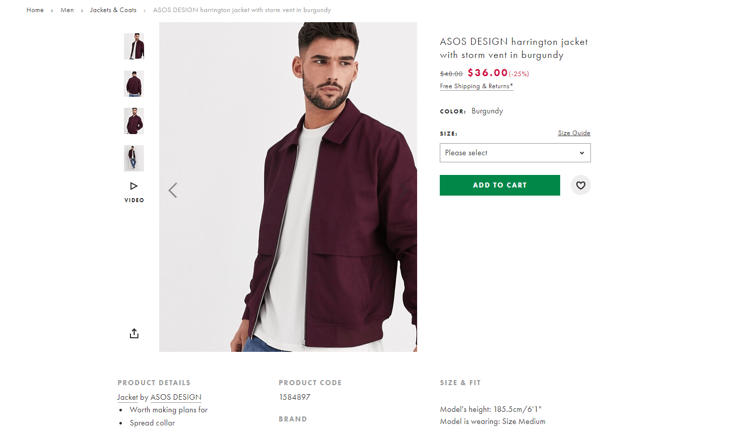
The main thing that catches the eye is the large photo of the product presented by the model. Thanks to this, you can see the cut and the way the fabric fits over the body. On the left side, we see a photo gallery presenting the product from different perspectives. We can also look at the detail. The video footage shows well how the product looks in motion. It is worth paying attention to the subdued, grey background and careful rendering of the actual colors.
The product description is very short and focused on specificities. The size drop-down menu allows you to quickly select a specific model. The CTA button is the only (not counting photos) colored element on the page - thanks to this it is visible.
Nike
In this case, a different way of presenting the product was chosen. We can see 4 photos simultaneously that present the product from different perspectives. On the right side, there are pictures of the product in a different colors. Thanks to this, the customer will reach all color versions of a given model faster.
Samsung
In this example, it is worth paying attention to how the product is presented in the photo. On the screen, we see fancy shapes that visualize the display of graphics in perfect quality. The dimensions given allow you to imagine the size of the product.
Select the model size by clicking on one of the three visible options. A well-displayed assessment of users confirms the high quality of the product. The creators of the Samsung website also took care to show complementary products.
Lidl
The main image shows the product in context. Placing the kettle on the kitchen counter allows you to better visualize the product in use. The next photo shows the available colors.
An interesting option is to place social media icons on the product page, which allows you to quickly recommend the product to your friends. Thanks to this, the offer becomes more visible on the Internet, and in addition, making it available to the user does not involve any advertising costs for the store.
In all the examples, attention is drawn to the quality of the photos. The photos have a high resolution, thanks to which it is easy to enlarge them and see details. Adequate lighting, color reproduction and framing were taken care of.
Conclusion
The product card is one of the most important factors influencing the purchasing decision. Therefore, it is worth taking the time to design.
Other articles.
WebWave website builder is your AI-powered solution for building an online presence. Create your website in 3 minutes, add an online store or a blog, and grow your business.
We created this website with WebWave.
Follow us on social media


