Good UX - create a user friendly website
Updated: 16th September 2022
Reading time: 7 min
Every website should be created with users in mind. The success of a site depends on a large extent on the way people perceive it. In this post, we'll take a closer look at the website user experience. We will show what User Experience is, how to design attractive websites from the user's point of view, and discuss the most important trends in UX.
What is Good UX and why is it important for your website?
According to Wikipedia, UX (User Experience) is a person's emotions and attitudes about using a particular product, system, or service.
UX is one of the most important aspects of creating a website. If the page is user-friendly, it attracts people. A good design focuses primarily on the user experience. Thanks to this, the person who visits the site will stay there longer and will be happy to come back to it in the future.
User Experience is particularly important in getting a good conversion rate. Conversion rate the percentage of users who perform the action you want on your site, for example, making a purchase, reading blog entries, subscribing to the newsletter.
If the navigation on the page is not intuitive, the buttons are hardly visible and the texts on the page are hardly understood, the visitor will quickly get lost, and thus leave the page.
User Experience, User Interface, Web Design - how they differ from each other
These 3 terms are closely related, but they should not be used interchangeably, because they relate to 3 different things.
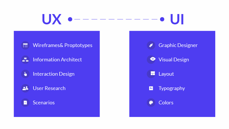
User Experience is, as we have already mentioned, about personal attitudes and emotions. Designing UX is about providing the user with a product that will ensure the best possible experience. User Interface is all elements of the page that enable user interaction with the site. Webdesign is a term that covers all aspects creating websites, including UX and UI.
Skills of a good UX designer
User Experience is an interdisciplinary field - it requires extensive knowledge and skills in several areas, primarily psychology, design, marketing, and IT. The UX specialist must master a wide range of skills because their tasks are very diverse.
WebWave AI Writer
Generate your website copy with just one click.
WebWave AI Writer
Generate your website copy with just one click
10 Nielsen heuristics
Behind this difficult concept lies a set of basic principles that a good UX designer should follow. They were created by Jakob Nielsen - one of the most recognized specialists in the UX industry.
-
System status visibility
The user should always know where he is and what is currently happening.
-
The connection between the system and the real world
The site should use communication methods known to the user. Use words, navigation methods, and concepts that a person using your site encounters on a daily basis.
- User control over the system
Users often make mistakes. Therefore, you should allow them to quickly undo changes.
Maintaining consistency and standards
The user should not wonder what the messages mean in a given context. They should be the same every time.
-
Error prevention
When creating the page, pay special attention so that no errors appear on it that make it difficult to use the site (for example, broken links, incorrect navigation or illegible texts).
-
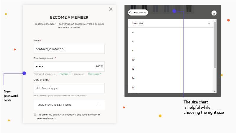
Choice instead of remembering All necessary options (such as return to the main page, access to the order basket or contact) should be easily accessible from the individual subpages. Thanks to this, the user does not have to remember the structure of the page to move freely on it.
-
Flexibility and efficiency
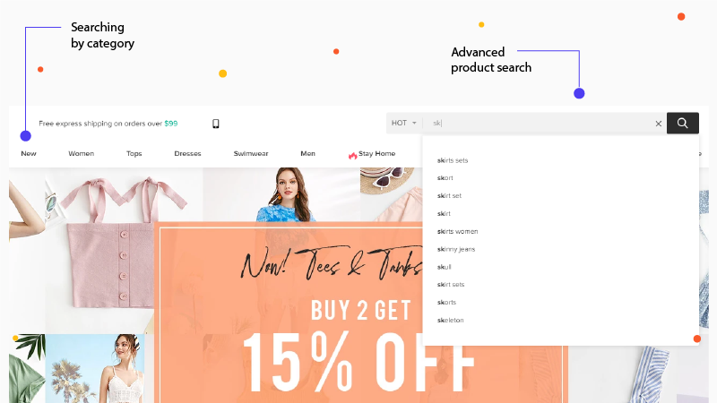
People use websites in different ways. For example, some prefer to access the information they are looking for using the menu, while others use the search engine to do so. You should ensure the best experience for the widest possible group of users.
-
Aesthetics and minimalism
The page should contain only necessary elements, it cannot be "overloaded". Any unnecessary information disrupts the user's interaction with the site.
-
Clear communication in case of errors
If the user has encountered an error, you should explain in clear language what happened and what to do.
-
Help and documentationSometimes users need help or additional, detailed information about the operation of your website. Make sure help and documentation are easily accessible.
Information architecture on the site
Information architecture is a field that deals with the appropriate presentation of content on a page like PDP ecommerce. It primarily focuses on access to information. This is one of the most important elements when it comes to website usability. Therefore, you should pay special attention to it.
A page with good information architecture allows the user to easily navigate and quickly find content. It makes the user perform the actions desired by the creator of the site.
Most often, one of three ways is used to create a good information structure on the site.
-
Creating a sitemap- a project for placing content in individual places on the page.
-
Sorting cards. In this method, individual pieces of information are written on separate sheets. You give them to a group of potential users of the site. Their task is to group cards in the way they think the information on the page should be presented.
-
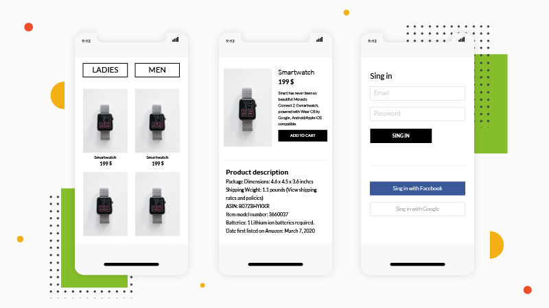
Creating prototypes and wireframes (preliminary outlines of the appearance and functionality of the future site, including the distribution of content on the page, which can be done using specialized wireframe tools).
Adaptation to mobile devices
Currently, the majority of website traffic comes from smartphones. Therefore, when designing websites, special attention is paid to the experience of users of mobile devices.
The best way to meet the needs of people accessing the site by phones and tablets as well as computers is to create a responsive page - a site that adapts to the size of the screens of the devices on which it is displayed. Building such a website is facilitated by website creators such as WebWave.
Making changes on the page
Designing UX is not just about creating a user-friendly page. The appearance of websites is constantly changing. New technical solutions and fashions are emerging. The changes also affect users' expectations.
What's more, even if the solution works well, it is possible to create even better one. Therefore, it is necessary to monitor user behavior on the site and make changes that improve the UX of the site.
How to test the Good UX solutions
The primary tool used for this purpose is Google Analytics. This tool is used to measure website traffic. Thanks to it you will learn, among others:
-
How many users visit your site,
-
How users get to your site (e.g. by entering its address directly in the browser window, by searching for keywords or advertising),
-
How much time they spend on the site,
-
Which web pages are the most popular.
The information collected through Google Analytics will allow you to optimize the page and improve the conversion rate.
Mockup
It's a project that contains specific elements of the page. It looks like a working website. However, it lacks functionality - the individual web pages are not integrated, which means that you cannot navigate the mockup page like a finished website.
Prototype
This is a preliminary version of a working page that allows you to test specific solutions before making the site available to all users.
After checking and approving the design of the site, web developers encode the final version ready for publication on the web.
Website design in website builders
Using website builders such as WebWave can significantly speed up the work on a page. They allow you to create mockups, prototypes, and ready-to-publish pages with one tool. What's more, many people can work on the page created in the website builder at the same time, because the project is available online. In addition, publishing your site on the internet does not require coding - you can do it with one click.
Current trends in UX
As we have already mentioned, UX is a very dynamic field. That is why you should follow the latest trends and observe effective solutions from competitors. What UX development trends can we see in 2020?
Dark mode - is it good for UX?
The dark user interface is gaining popularity. The black background causes less light to reach the eyes, which may be important for users visiting the site before bedtime. In addition, aesthetic issues are important - in most cases, dark mode will look elegant and professional.
Harmony of colors
More and more sites have a limited color palette. The use of colors lying close together on the color wheel makes the design look more elegant. In addition, websites in non-contrasting colors are less tiring to look at.
Combination of graphics and photographs
In recent months web designers are more and more willing to reach for photos enriched with graphic elements and collages. This gives photography a more individual touch and helps website owners stand out from the competition.
Conclusion on Good UX
User Experience is an issue that must be remembered at every stage of running a website - from the initial design through the selection of specific solutions to ongoing maintenance and updating.
A good UX of the site makes it easy for the user to find it on the web, reach the information he is looking for and return to your site in the future. It's also cohesive with Google's Core Web Vitals.
Creating a website that will meet the user's needs is not an easy task. Especially people who create a website for their own use may have a problem with it.
WebWave templates can be helpful here. These are ready-made AI web design that have been prepared with the best user experience in mind. Treat them as the skeleton of your page, which you can fill with any content. Thanks to this, creating a company website, portfolio, or online store will be simple and quick.
Try WebWave templates and create a website without coding for free!
Author: Monika Buchlet
Other articles.
WebWave website builder is your AI-powered solution for building an online presence. Create your website in 3 minutes, add an online store or a blog, and grow your business.
We created this website with WebWave.
Follow us on social media


