What has changed in WebWave - check out the most important new features
Updated: 16th September 2022
Reading time: 6 min
Despite the difficulties associated with the COVID-19 epidemic, our team has been working hard in recent months. We were able to introduce many changes, thanks to which the WebWave website builder gained new features, and working with it has become even easier. In this post, we present the most important changes from the perspective of our users.
Dotpay payments in the WebWave cart
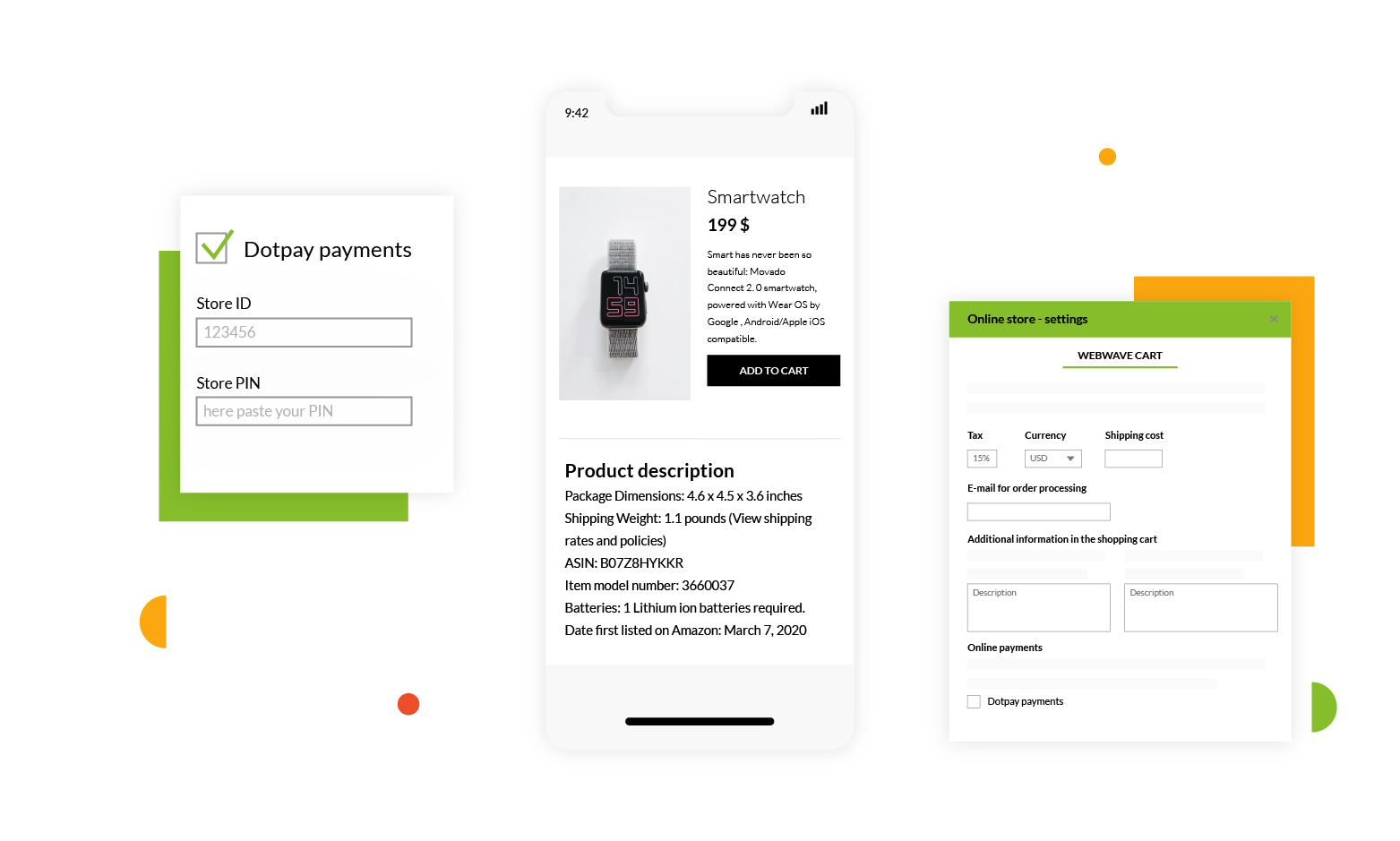
All WebWave users who create an online store in our website builder have been waiting for this function. Now downloading and managing payments has become much easier.
We've added the option of integrating the store with the Dotpay system. Now customers can pay for purchases directly on the site using one of several methods - from the card and transfer payments via BLIK to Apple Pay.
Thanks to this, the functionality of the WebWave Cart has significantly increased, which translates into a smaller number of people resigning from the purchase. You will create a 100% professional store where you can easily and efficiently manage payments. Now you have the ability to control all the most important store functions in one place. Thanks to this, its service has become easier and faster.
Element effects
We always try to give users the greatest possible control over the design of the site. That is why we decided to introduce new functions related to element effects.
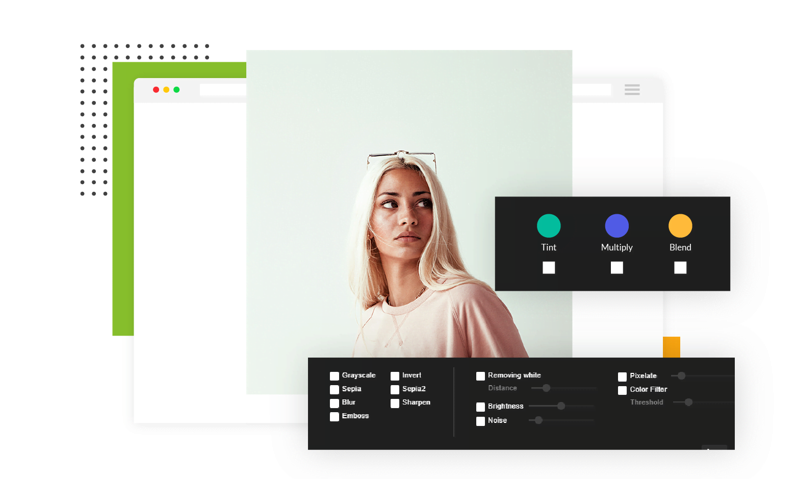
First of all, now you can easily apply as many as 10 different filters: blur, brightness, contrast, grayscale, hue, saturation, sepia, color inversion, as well as color and gradient. Thanks to these changes you will give your website a unique look. For example, you can get a "retro" effect using sepia or shades of gray.
Secondly, you can make the button change when you hover over it.This way you will add dynamics to your website and make the button stand out even better.
WebWave AI Writer
Generate your website copy with just one click.
WebWave AI Writer
Generate your website copy with just one click
Facilitating work with elements
We have also introduced two very useful functions to speed up work with elements. Creating your own element groups will allow you to have the most used combinations always at hand. Thanks to this, you will quickly create many pages where you use similar sets of elements, for example in the footer or menu. You will not have to compose the whole group from scratch each time. All you have to do is add to the project the one that you have already saved in the website builder.
It is also easier to set several elements at equal distances - the website builder will tell you where to drop them to keep the same spacing. This feature is useful wherever you want to arrange the elements symmetrically with each other, for example, when creating a list of products in an online store.
Faster page loading
Loading speed is crucial when Google evaluates the page. It also affects the user experience. That's why at WebWave we attach great importance to this.
Recently, we have been able to speed up the loading of images. Now they load first in worse, and only later in the target quality. Thanks to this change, the pages created in WebWave load even faster.
Easier linking
We have changed the functioning of our link editor. Now you will add links to your site even faster. It's also easier to find a specific web page or article to link to - in the editor we've added a search engine.
If you want to track changes in WebWave on an ongoing basis, please visit the new features page. We update it at least several times a month. You will find a list of all new features along with instructions that will help you put them into practice.
Despite the difficulties associated with the COVID-19 epidemic, our team has been working hard in recent months. We were able to introduce many changes, thanks to which the WebWave website builder gained new features, and working with it has become even easier.
What are we planning for the future
Although we have been able to introduce quite a few functions in recent months, we are not slowing down. We are working on many really useful functionalities. Here are some of them:
-
Simplifying editing of the classic image grid - using the classic image grid will look just like Masonry Gallery.
-
Image grid - horizontal mosaic - new image grid layout to show graphics in an even more attractive way. In this layout, horizontal images will look best.
-
Showing the distance between elements - thanks to this function you will be able to determine their position even more precisely.
-
Changing the distances between elements - you'll be able to change the distances between many elements at once with one drag.
You can find the current list of all planned changes and the degree of their implementation here.
Author: Jan Chmielowski
Other articles.
WebWave website builder is your AI-powered solution for building an online presence. Create your website in 3 minutes, add an online store or a blog, and grow your business.
We created this website with WebWave.
Follow us on social media


